Understanding CSS Box-Sizing: A Comprehensive Guide
Written on
Chapter 1: Introduction to Box-Sizing
A few years back, during a job interview, I was asked about the box-sizing property in CSS, and I found myself at a loss. This was largely due to my focus on programming rather than design elements in front-end development. After that experience, I decided to delve into the topic, and here’s what I learned.
In essence, box-sizing determines how the dimensions of an HTML element are calculated, specifically how the content, padding, and borders factor into its total width and height. For example, if you have an element that is 200px wide and applies 50px of padding, using the border-box model would adjust the effective width to 100px, as the padding consumes space on both sides.
Section 1.1: Visualizing Box-Sizing
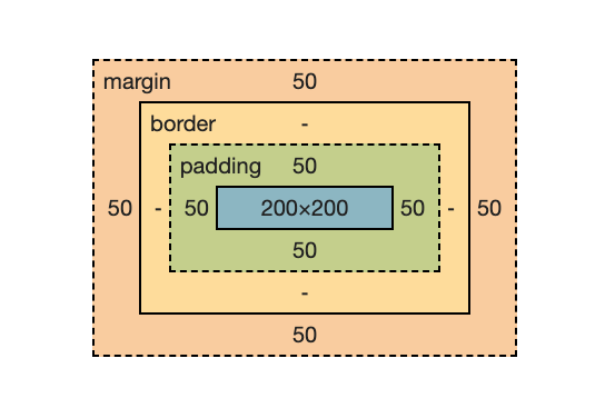
Let's consider a square div with a width and height of 200px, using the default box-sizing setting, content-box:

What you're observing here is a rather striking green square. However, the dimensions are what truly interest us:

As evident, the square has both a width and height of 200px, alongside 50px of padding on each side. In the content-box model, padding is considered separately from the element's overall dimensions. Therefore, adding more padding will increase the size of the component.
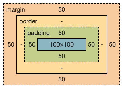
Now, if we adjust the box-sizing to border-box, you'll notice a significant change:

With the border-box model, the width and height define the total size of the element. When padding is added, it reduces the available space for content instead of expanding the element itself. Setting a width of 200px and adding 50px of padding on each side results in an effective width of only 100px (200px - (50px x 2)).
Section 1.2: Impact of Borders
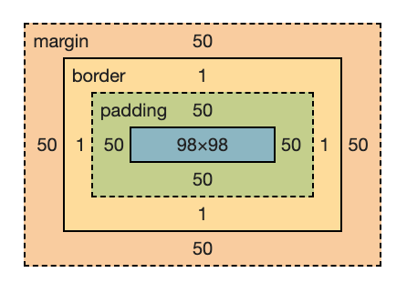
Now, let's introduce a small border of 1px to our component by adding border: 1px solid black to our CSS. The new dimensions will be:

Here, the border consumes an additional 1px on each side (totaling 2px for both width and height), which, along with the padding, results in an effective width of 98px. The larger the borders, the smaller the effective content area will become.
Wrapping Up: The Benefits of Box-Sizing
The box-sizing property is a valuable tool in CSS, particularly when you want to maintain specific dimensions for a component while adding padding without complications.
For a more in-depth understanding, check out these videos:
In this video, "Box-Sizing: Border-Box Explained," you'll gain further insights into this essential CSS property.
Watch "The Box-Sizing Property Explained in 5 Minutes" for a quick yet informative overview of box-sizing.
If you found this article helpful, please consider showing your support with a clap or a follow!
Additional Resources
Here are some related topics that might interest you:
- Enhance your programming skills with innovative project ideas.
- Learn how to effectively test your React hooks.
- Simplify testing through mocking with Jest.
- Discover how to build and deploy a Node.js application using Docker.